library(ggplot2)
MyData<-read.csv(
"https://colauttilab.github.io/RCrashCourse/FallopiaData.csv")Basic Customization
Introduction
Now that you know how to use R to to quickly generate graphs, we’ll explore how to customize our graphs to make high-quality figures for publication.
There are a number of parameters and other functions available with ggplot() that you can use to quickly customize your graphs. First, we’ll look at the different ways to customize the look and feel of our graphs. Then, we’ll combine multiple graphs in the same multi-panel figure. In addition to generating more complex figures for publication, these multi-panel graphs can come in quite handy for exploring more complex data set.
Setup
Continuing from the last chapter, load the ggplot2 library and set up our plotting data.
binwidth
As we noted briefly in the last chapter, we can use binwidth with the histogram graph type to alter the size of the ‘bins’ along the x-axis. A bin is defined by a range of values (x-axis). The bin count or frequency (y-axis) shows the number observations (or fraction) that fall within each bin range.
The binwidth defines the range of values (i.e. width) of each bin. Here are a couple of examples for comparison.
library(ggplot2)
ggplot(aes(x=Total), data=MyData) + geom_histogram(binwidth=9)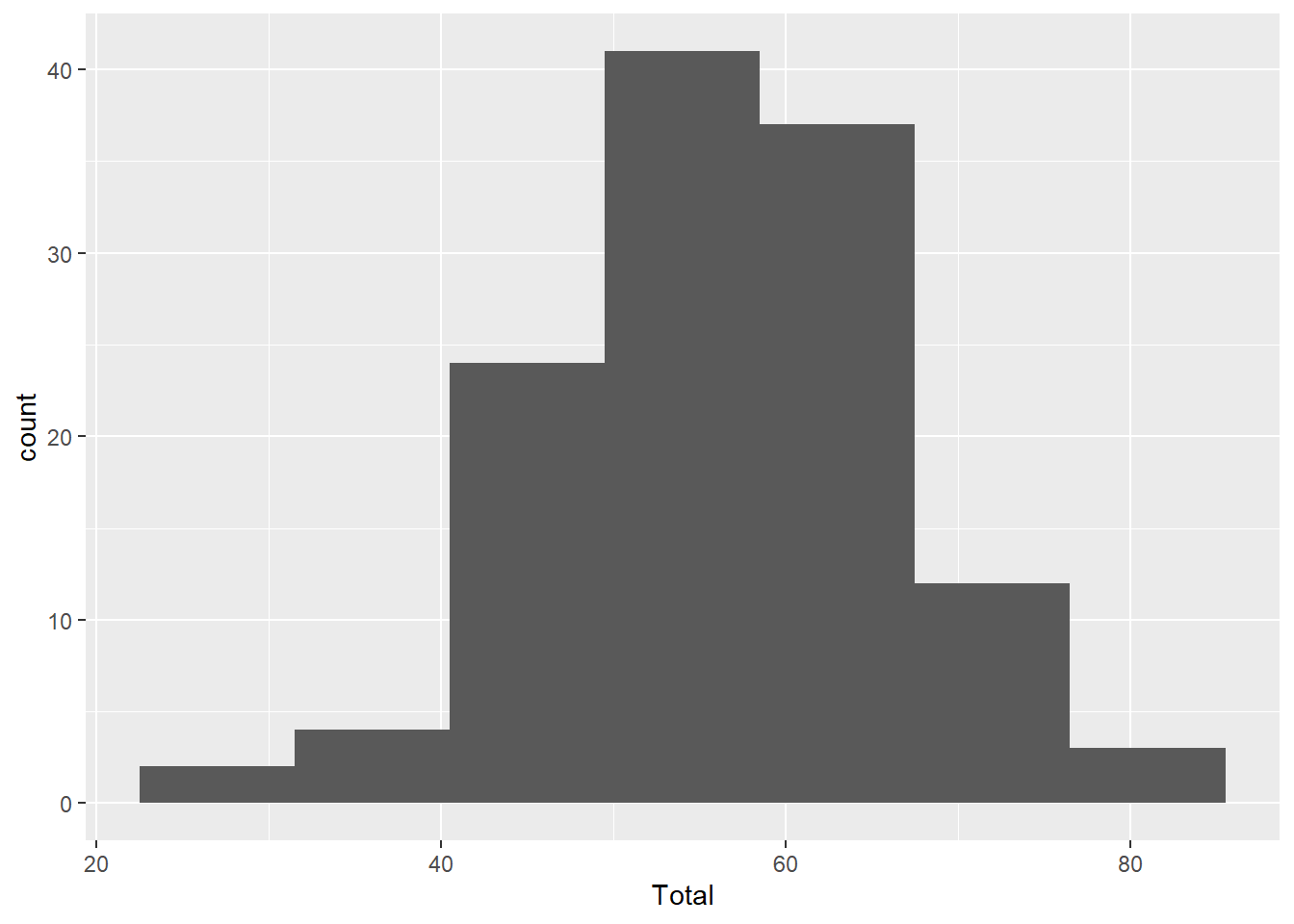
ggplot(aes(x=Total), data=MyData) + geom_histogram(binwidth=0.5)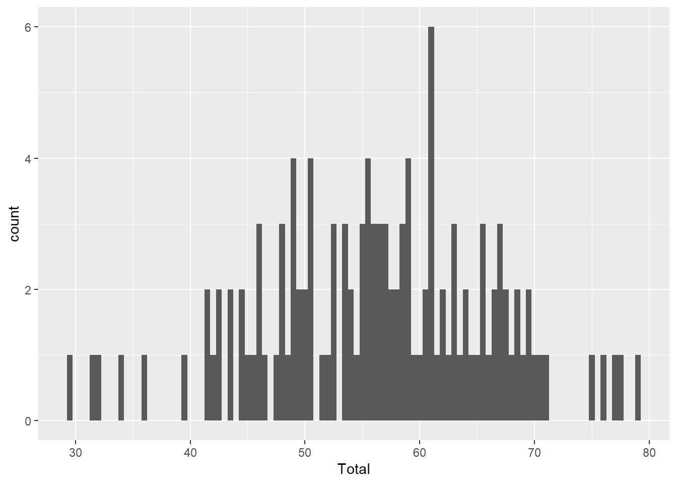
Compare the code for each graph to understand how binwidth affects both the y-axis values and the width of the blocks along the x-axis. Wider bins contain more observations, just like larger barrels catch more rain.
size
This controls the point size. Importantly, size values can be interpreted by R in two ways, which can cause some confusion:
- As a single value: To assign a specific size to all points. This is assigned in the
geom_point()function
ggplot(aes(x=Silene, y=Total), data=MyData) +
  geom_point(size=5)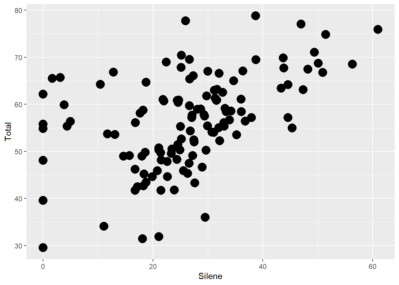
- As a set of values defined in a vector: Scale size based on a column of data (e.g. number of observations). This is defined in the
aes()function.
From the perspective of the R console, these are pretty much the same thing since a single value can be treated as a vector with just one element.
ggplot(aes(x=Silene, y=Fallopia), data=MyData) +
  geom_point(aes(size=Total))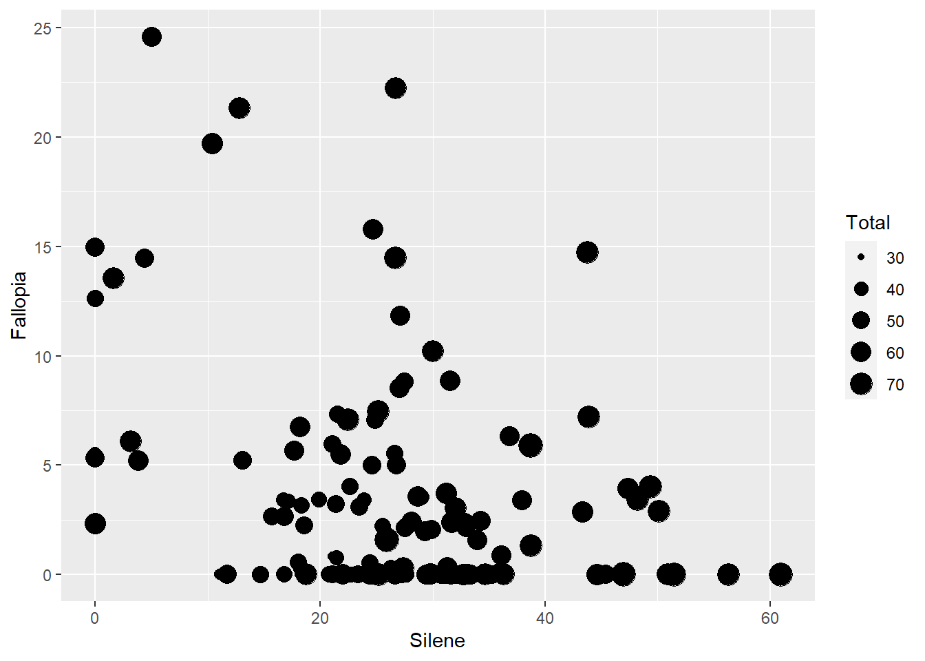
NOTE: The following code will produce the exact same graph.
ggplot(aes(x=Silene, y=Fallopia, size=Total), data=MyData) +
  geom_point()
Compare this ggplot() function with the two previous.
Question: What do you think is the difference between putting an
aesfunction inside ofggplot()vs inside ofgeom_point()?
Answer: It’s important to understand the difference, even though in this specific example it doesn’t change the graph. Here is a short summary:
If we put a variable inside of
ggplot()then the parameter applies to ALL of the geom functions that follow it.If we put a variable inside of a geom like
geom_point(), then the parameter applies ONLY to that specific geometric shape layer.We use
aes()when refereincing a column from our input data.
We’ll dive into these ideas in more detail in the next chapter, when we start to produce more complicated graphs with multiple, overlapping geoms.
Before continuing, take a moment to make sure you understand the three different examples of code and resulting output above.
alpha
Think of alpha as a measure of opacity, ranging from 0 to 1 with 1 being the default – a solid point or line.
This is particularly useful for visualizing overlapping points.
ggplot(aes(x=Silene, y=Total), data=MyData) +
  geom_point(aes(colour=Nutrients), size=5, alpha=0.3)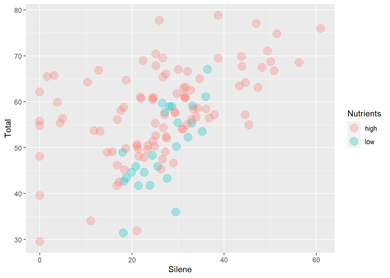
colour (or color)
Another nice feature of ggplot is that you can use alternate English spelling for some of the parameters. For example, you can use colour= or color= add colour to your color graphs.
Similar to point sizes, you can use colours in two main ways.
- You can colour points based on a factor.
ggplot(aes(x=Silene, y=Fallopia), data=MyData) +
  geom_point(aes(colour=Nutrients))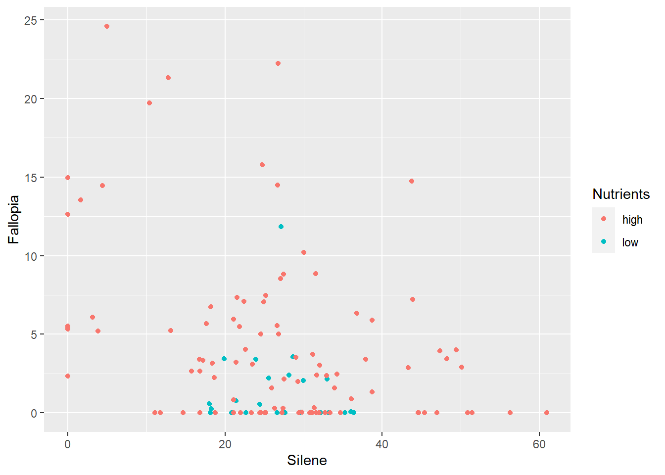
… or a continuous variable.
ggplot(aes(x=Silene, y=Fallopia), data=MyData) +
  geom_point(aes(colour=Total))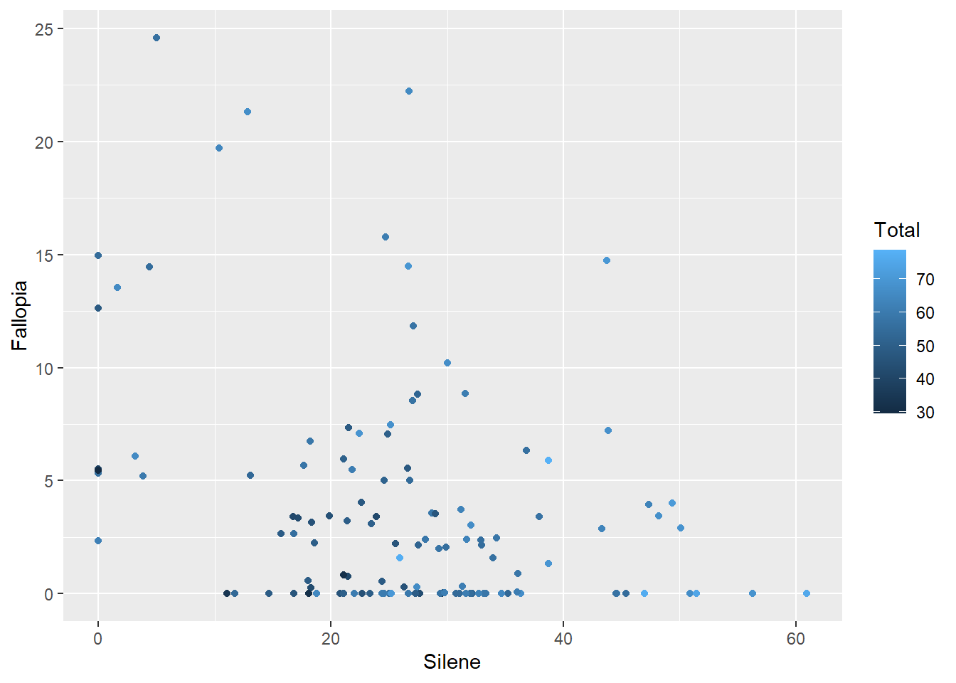
- You can choose a specific colour to apply to all points.
ggplot(aes(x=Silene, y=Fallopia), data=MyData) +
  geom_point(colour="grey60")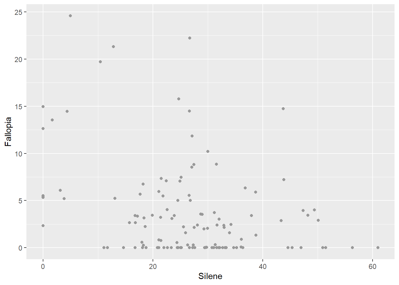
Colour With rgb()
Several colours are available as strings (e.g. "red", "blue", "aquamarine", "coral", "grey20", "grey60"), but if you can’t find one that you want, you can make just about any colour with the rgb() function. The rgb function takes three values corresponding to the intensity of red, green and blue light, respectively. Values range from 0 (no colour) to 1 (brightest intensity).
ggplot(aes(x=Silene, y=Fallopia), data=MyData) +
  geom_point(colour=rgb(1,0.7,0.9))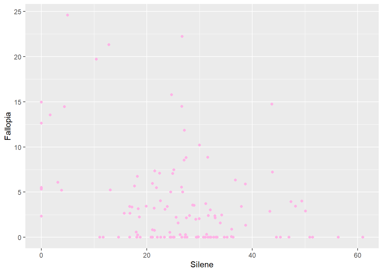
Some colouring systems use a 256-bit scale (0 to 255) instead of 0 to 1, which you can specify in the rgb() function with the maxColorValue = 255 parameter. See ?rgb for more information.
Hexadecimal Colour
Another common format for colour uses a hexadecimal system. In fact, the hexadecimal code is the output of the rgb() function that R uses for plotting:
rgb(0.1,0.3,1) [1] "#1A4DFF"I(rgb(255,0,0, maxColorValue=255))[1] "#FF0000"The hexadecimal system is a base-16 alphanumeric code that is common in computing. It uses the numerical digits 0-9 followed by the letters A (11) through F (16) as the 16 characters.
Hexadecimal colour codes are used by a variety of computer programs. For colouring visualizations with ggplot, we use a 6 OR 8-character hexadecimal code, starting with the hash mark # and saved as a string using quotation marks.
The 6-digit hexadecimal colour code uses two digits for each base colour: red (r), green (g) and blue (b), or #<rrggbb>. We’ll see an example to help clarify this.
This 6-digit code results in \(16 × 16 = 256\) shades of each colour, or \(256^3 = 16,777,216\) total colour combinations
The 8-digit hexadecimal colour code is similar, with the additional two digits at the end to define the level of alpha/transparency.
The rgb() function converts a vector of red, green, blue, (and optional alpha) to the 6- or 8-digit hexadecimal equivalent.
rgb(1,1,1,0.5)[1] "#FFFFFF80"Alternatively, transparency can be specified with the alpha parameter, as noted earlier.
Histogram
Note what happens when we use the colour parameter for a histogram.
ggplot(aes(x=Total), data=MyData) +
  geom_histogram(aes(colour=Nutrients), bins=10)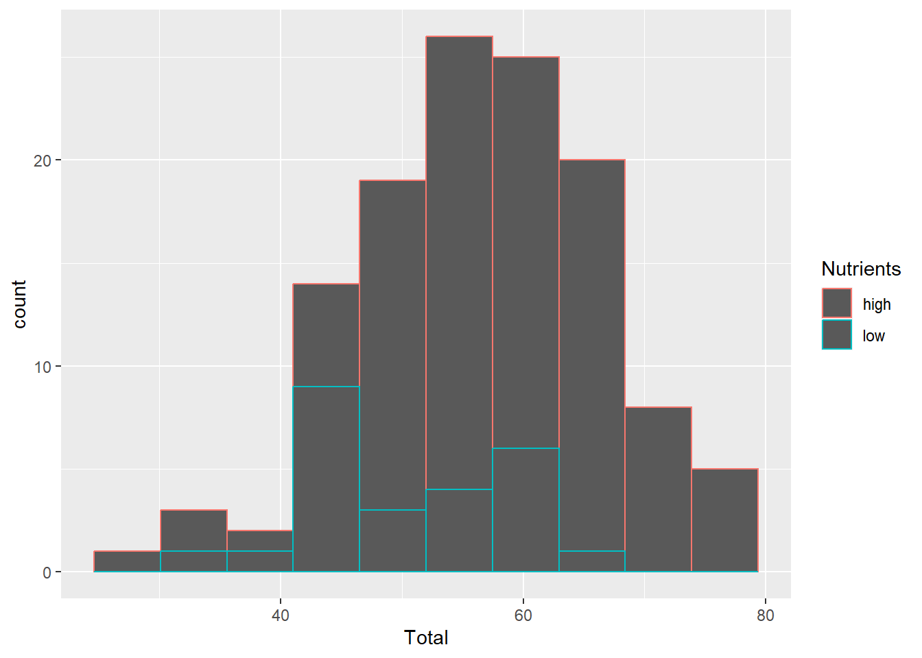
The coloured outlines might be useful in some cases, but we usually want the entire bars coloured. We can use the fill parameter for this.
fill
This parameter is used for histogram boxes and other geometic shapes that have a separate outline (colour=) and interior (fill=).
ggplot(aes(x=Total), data=MyData) +
  geom_histogram(aes(fill=Nutrients), bins=10)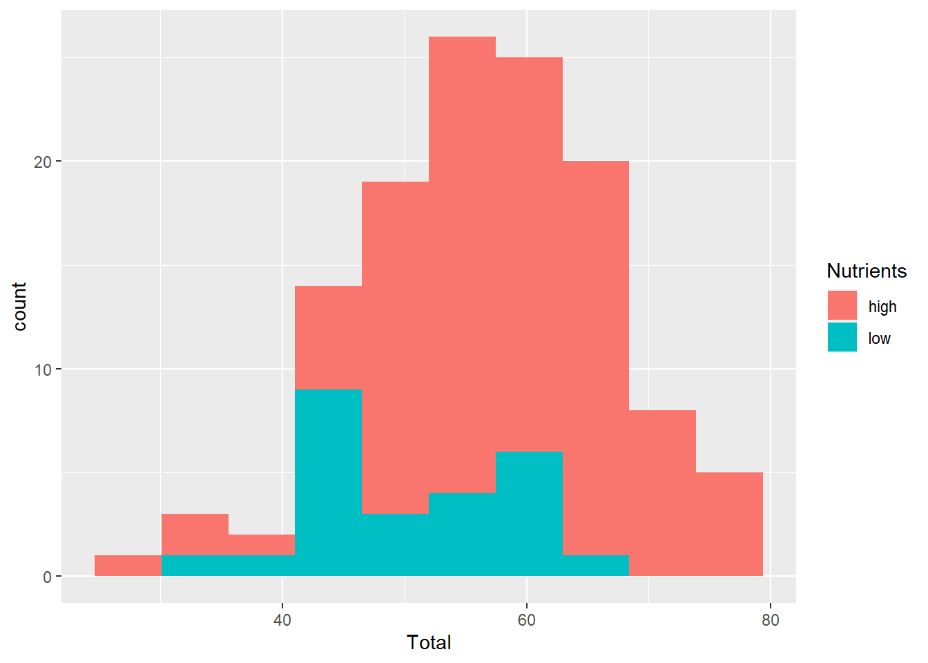
position
Use this to adjust the position, usually for histograms or bar graphs. For example, in the previous graph the bars are ‘stacked’ on top of each other. It can be hard to interpret a histogram with stacked bars, but we can shift the position using dodge.
ggplot(aes(x=Total), data=MyData) +
  geom_histogram(aes(fill=Nutrients), bins=10, position="dodge")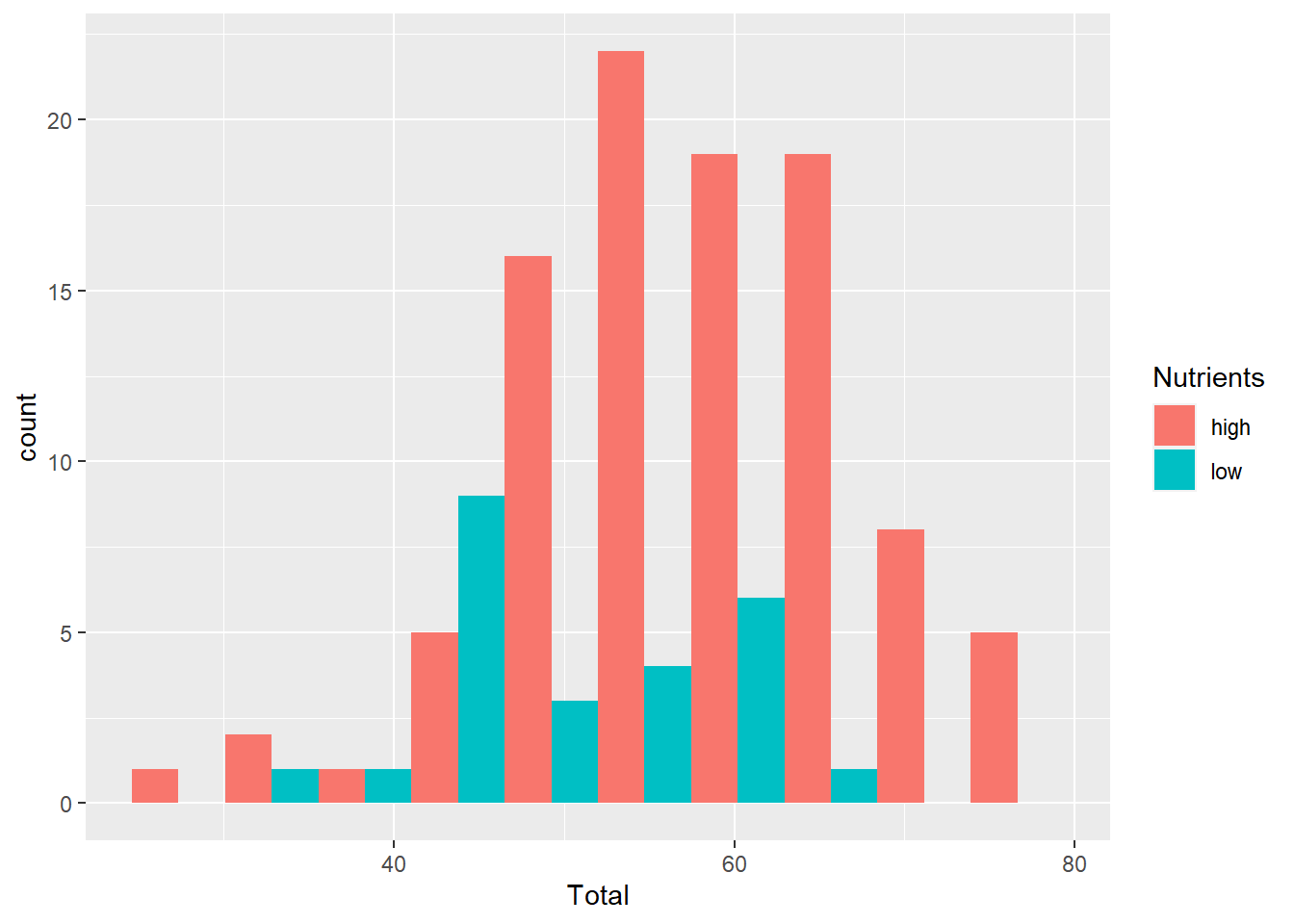
shape
You can also change the shape of your points, again using a column of data or a specific value.
ggplot(aes(x=Silene, y=Total), data=MyData) +
  geom_point(aes(shape=Nutrients))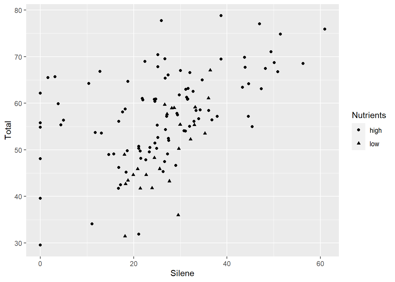
ggplot(aes(x=Silene, y=Total), data=MyData) +
  geom_point(shape=17)
There are a number of different shapes available, by specifying a number from 0 through 25.
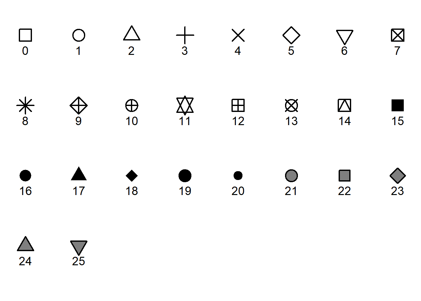
Note that the shapes with grey in the above figure can be coloured with fill= parameter, while all of the black parts (lines and fill) can be coloured with the colour= parameter.
You can use fill and colour to customize these separately.
ggplot(aes(x=Silene, y=Total), data=MyData) +
  geom_point(shape=21, size=5, colour="purple", fill="yellow")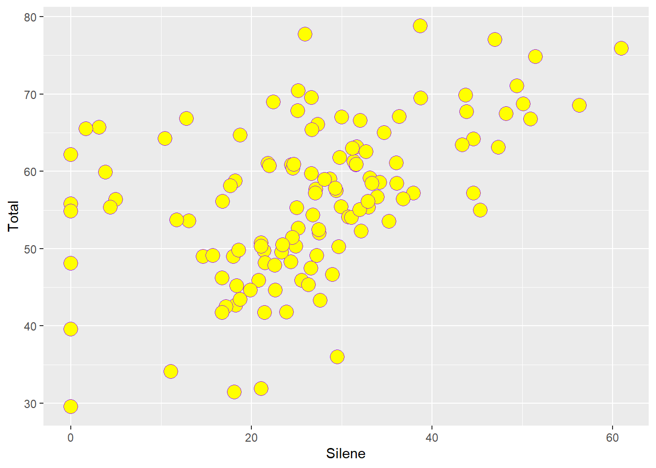
Note how a solid outline can help your points ‘pop’.
Similarly, specifying a solid colour can definition to a histogram graph.
ggplot(aes(x=Silene), data=MyData) +
  geom_histogram(bins=20,colour="darkred",fill="aquamarine")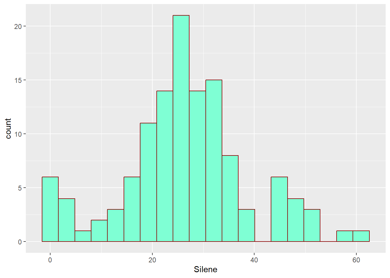
lab, xlab, and ylab
Use these to customize your axis labels.
ggplot(aes(x=Silene, y=Total), data=MyData) +
  geom_point() +
  xlab("Silene Biomass") + ylab("Total Biomass")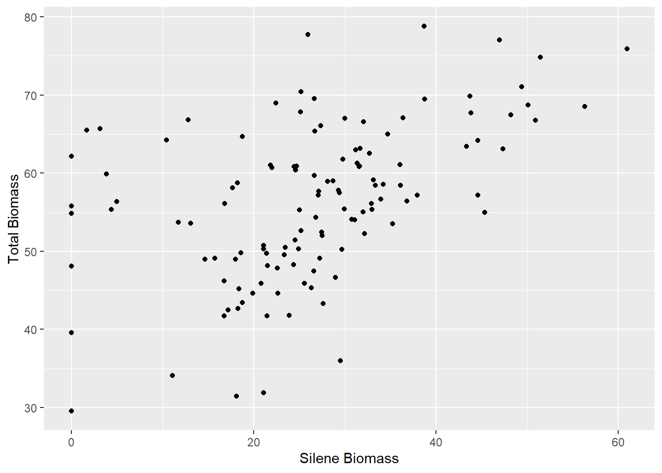
labs
This will add other labels to your plot. Usually you wouldn’t use this for a figure intended for publication – for this you would need a detailed caption, usually just a paragraph of text below the figure. However, these can be useful for other documents: reports, websites, presentations, supplementary material, appendices, etc.
ggplot(aes(x=Silene, y=Total), data=MyData) +
  geom_point() + labs(title="Biomass", subtitle="More info here",
                      caption="Appears after the figure")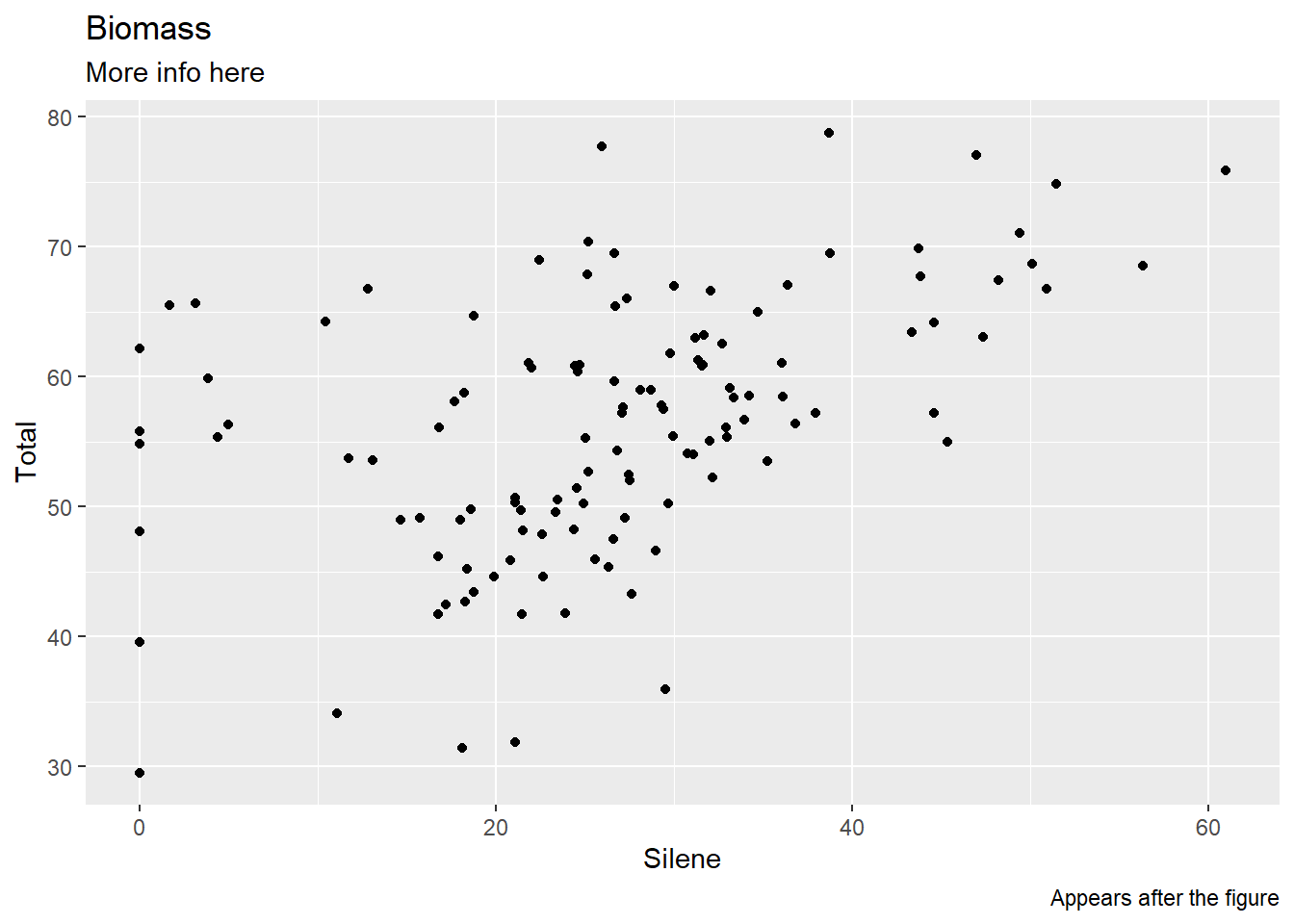
Themes and Geoms
We have already explored a few of the many Geoms available. These determine the geometry of your graph, which is how your data are mathematically mapped to the graphing space.
Themes define the look and ‘feel’ of your graphs.
In ggplot(), themes and geoms are added with a separate function linked to the graph by using the plus sign +.
geom_<name>()
We explored a few geoms above, but there are many more available on the ggplot2 website, with helpful examples: https://ggplot2.tidyverse.org/reference/
theme_<name>()
There are a number of available themes, defined by changing the <name> part of theme_<name>(). We’ll try potting these different themes on the same graph. Rather than type out the same ggplot() and geom_ functions every time, we can define an object to hold the data for the plot, and then just change the theme.
The default theme
Plot1<-ggplot(aes(x=Silene, y=Total), data=MyData) + geom_point()
Plot1 + theme_grey()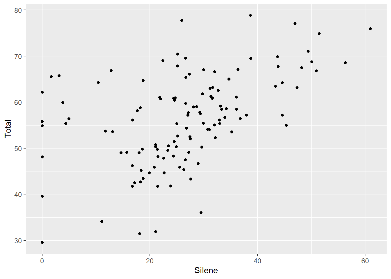
A cleaner theme with better contrast
Plot1 + theme_bw()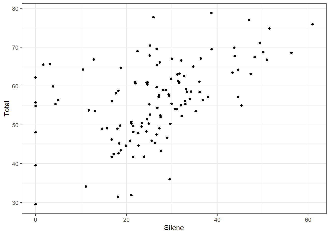
Thicker grid lines
Plot1 + theme_linedraw()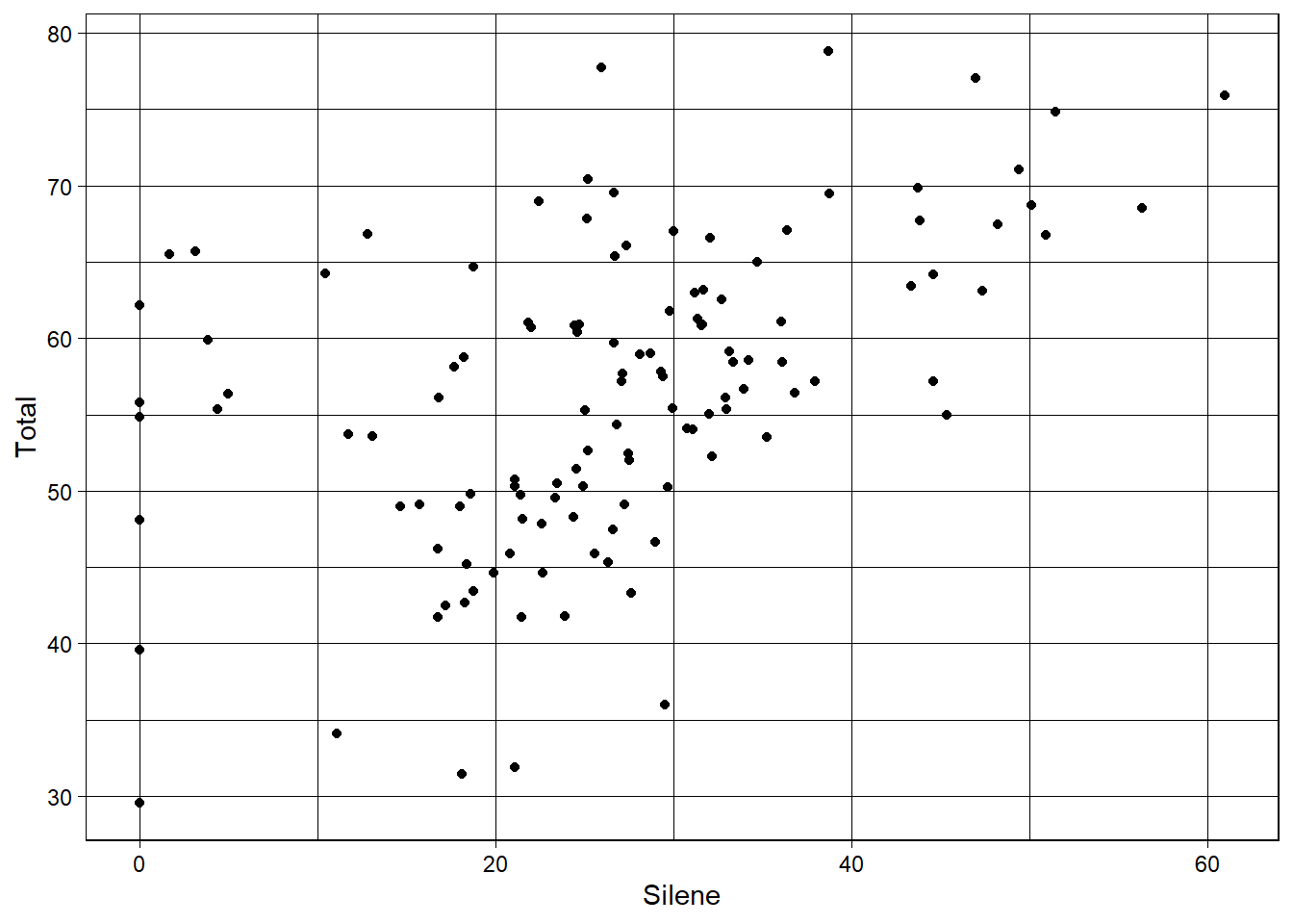
Fainter border and axis values
Plot1 + theme_light()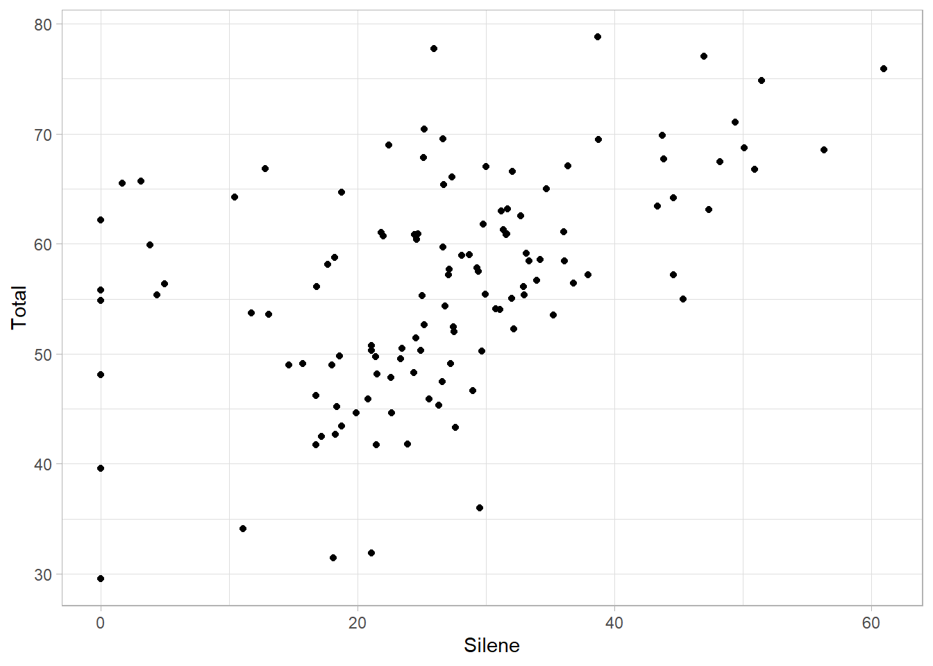
No borders at all
Plot1 + theme_minimal()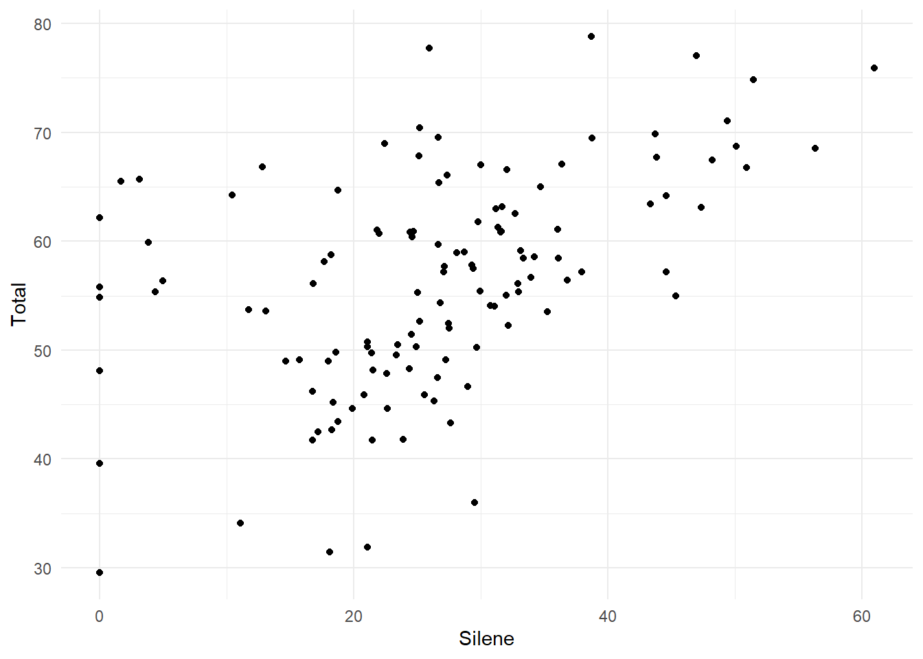
A minimal theme
This is closest to what you would see in a published paper, with x- and y-axis lines only
Plot1 + theme_classic()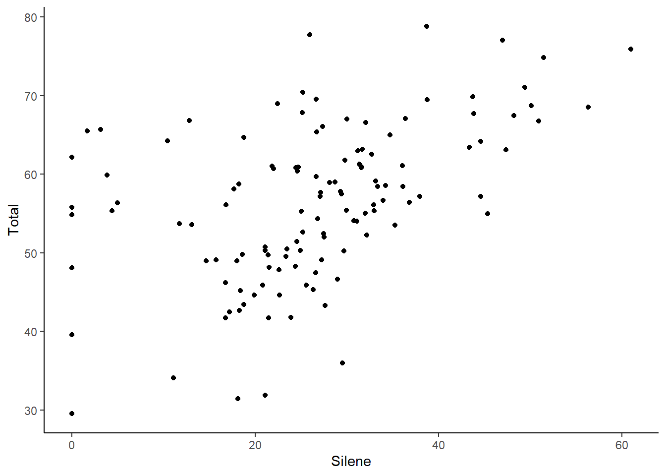
These can be further customized. Or you can create a completely new theme.
Custom Theme
Here is a simplified and cleaner version of theme_classic but with bigger axis labels that are more suitable for figures in presentation or publication. The theme is a function, which can be customized. Custom functions are covered in the Advanced R Chapter. For now you can just copy the code block below.
# Clean theme for presentations & publications
theme_pub <- function (base_size = 12, base_family = "") {
  theme_classic(base_size = base_size,
                base_family = base_family) %+replace%
    theme(
      axis.text = element_text(colour = "black"),
      axis.title.x = element_text(size=18),
      axis.text.x = element_text(size=12),
      axis.title.y = element_text(size=18,angle=90),
      axis.text.y = element_text(size=12),
      axis.ticks = element_blank(),
      panel.background = element_rect(fill="white"),
      panel.border = element_blank(),
      plot.title=element_text(face="bold", size=24),
      legend.position="none"
    )
}
To use this theme, you have to make sure you run the entire function (e.g. highlight every line and press Ctl + R or click Run in R Studio).
Alternatively, you could save it as a separate .R file (e.g. theme.R) and then load it with the source() function (e.g. source("./theme.R"))
Publication Theme
A third, even easier option, is to load the version of this code that is available online.
source("http://bit.ly/theme_pub")The theme is called theme_pub (pub is short for publication). To use it, run the above line, and then add it to your graphing functions:
Plot1 + theme_pub() 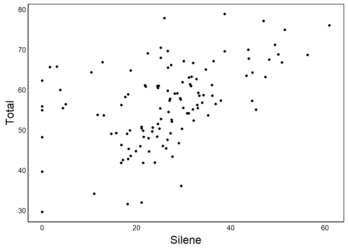
ggplot(aes(x=Silene),data=MyData) +
  geom_histogram(binwidth=2) + theme_pub()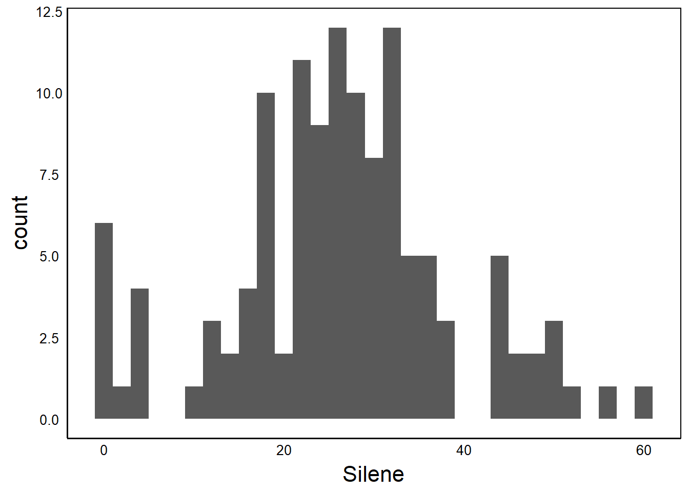
theme_set
If you want to use the same theme throughout your code, you can use the theme_set function.
theme_set(theme_pub())
Plot1
Now that we have run the source and theme_set functions, all of the graphs we make in this session will use the improved formatting. No more ugly grey background and tiny axis labels!
Basic Multi-Plot Graphs
It is often handy to plot separate graphs for different categories of a grouping variable. This can be done with facets in qplot.
facets
Facets have the general form VERTICAL ~ HORIZONTAL. Note the use of the tilde (~), not the dash (-). Use a period (.) to indicate ‘all data’ or ‘do not separate my data’, as shown in the fullowing examples.
Vertical Stacking
Plot2<-ggplot(aes(x=Silene),data=MyData) +
  geom_histogram(binwidth=2)

Plot2 + facet_grid(Nutrients~.)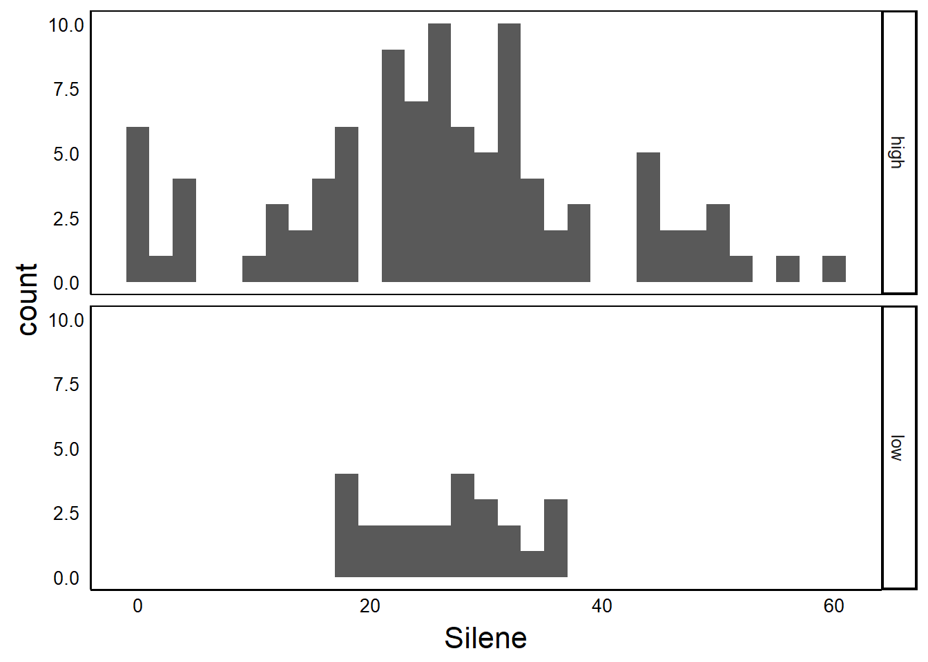
Horizontal Stacking
Plot2 + facet_wrap(.~Nutrients) 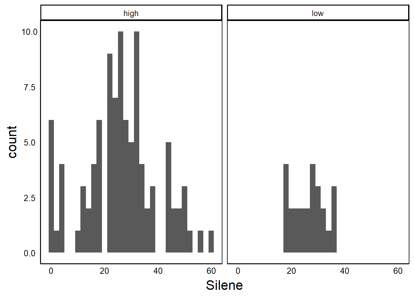
Horizontal by Vertical
Plot2 + facet_grid(Taxon~Nutrients)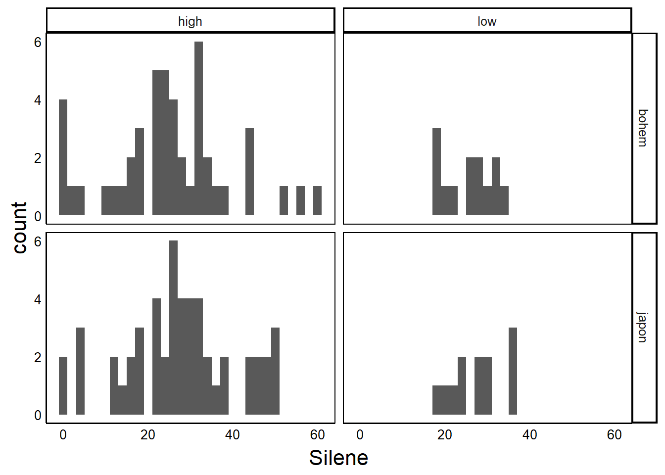
Graph Output
Graphing in R studio is okay for exploration but eventually you are going to want to save those beautiful figures you made, and this can be part of your reproducible workflow.
Writing code in R to save your graphs to an external file requires three important steps:
- Open a file using a function like
pdforsvgfor the vector format, orpngfor the raster format. Remember that you usually will want to stick with a vector format, for reasons discussed in the Graphical Concepts section earlier. - Run the code to produce the graph. Instead of seeing a graph in your R interface, you will not see anything because the graph is being sent to the file.
- IMPORTANT: Close the file! Do this with the
dev.off()function.
Failing to close the file is a common source of error when saving graphs. If you are having problems with graphing outputs, try running the dev.off() function a few times to make sure you close any files that are ‘hanging’ open.
Here’s an example code for making a pdf output of a graph. When you run it you should see a file appear in your working folder (you may have to refresh).
pdf("SileneHist.pdf") # 1. Open
  Plot2 + facet_grid(Taxon~Nutrients) # 2. Write
dev.off() # 3. Close
Note how the plotting function on the second line does not open in the plots window when you run this. This is because the info is sent to SileneHist.pdf file instead of the graphing area in R Studio.
Practice
Graphing may seem slow and tedious at first, but the more you practice, the faster you will be able to produce meaningful visualizations.
Don’t be afraid to try new things. Try mixing up components and see what happens. At worst you will just get an error message.
Once you have a good understanding of these basics, you can see how to build more advanced plots in the next chapter.